
Disclaimer: This content is provided for educational and entertainment purposes only and does not constitute professional advice. We do not guarantee the accuracy or completeness of any information presented. We are not liable for any actions taken based on this content. For specific issues or decisions, we recommend seeking professional advice. This content is not promoted on social media.
Author: Luke, Mediatimes.com.au
Your website is up and running and you’re spending so much money and time to maintain the business website, to give it more exposure but still not getting the conversion from the website?
You need to lean the concept of effective landing pages. As per SEO Brisbane blog, a landing page is a page where users land. Source of this traffic can be anything such as direct visitors, visitors from Google or Facebook and so on.
You’re about to learn how to make each element of your landing page more enticing. And make your conversion rates go up. And celebrate your business growing.
Ready?
Let’s start with creating seductive headlines.
How to command attention with your headlines
1. Be useful. Connect with your readers’ wants and fears. Carelogger increased their conversion rate by 31% because they focused on a desire of their target audience.

2. Observe the rule of one. Don’t confuse your web visitors by going in different directions. Your headline should focus on just one big idea. Corkscrew Wine Merchants increased their conversion rate by 148.3% when they focused their headline and picture on the same concept – a big discount.

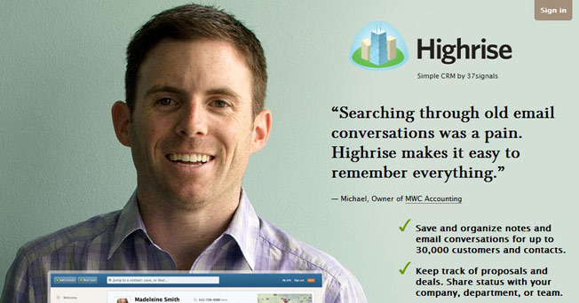
3. Be ultra-specific. Use numbers and exact names. Because being precise makes you more believable. Highrise increased conversion rate by 30% by specifying the length of their trial period.

4. Don’t be clever. Clever headlines often fail. Have you seen how simple Mailchimp’s headline is?

5. Be urgent. Encourage people to act now by providing a deadline.

6. Command attention. Use words that trigger emotion. Choose vivid adjectives. Include sensory descriptions. Crazy Egg uses power words like astonishing, power, and high costs in their headline.

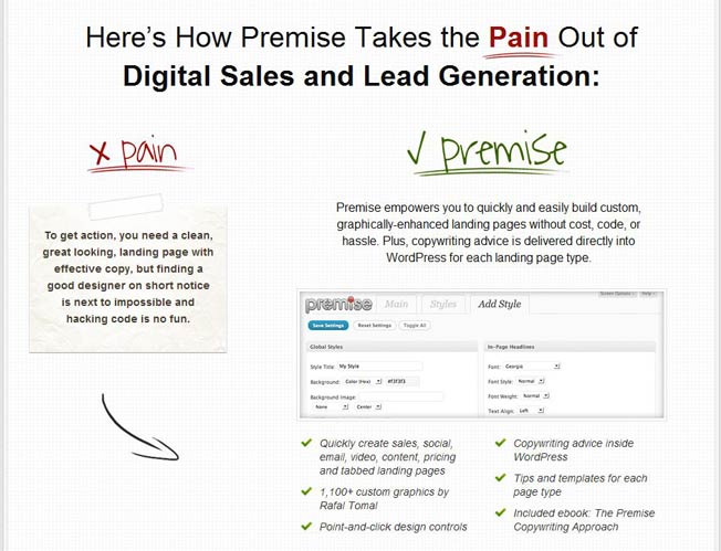
7. Focus on loss aversion. What does your audience lose by not taking up your offer? Focus on their potential loss and your conversion rate is likely to go up. The Premise home page shows the pains you’ll have to endure if you don’t use Premise to create landing pages.
How to write compelling copy
You’ve grabbed attention with your headline.
Now you need to create desire.
How?
Follow these 9 tips and entice your web visitors with persuasive copy.
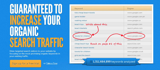
8. Use the word you. The word you has hypnotic power because it represents your name. It can more than double your conversion rate! HitTail uses the word your in the headline and copy.
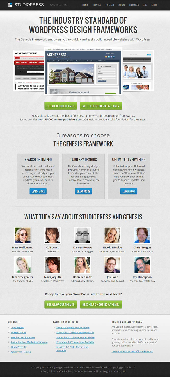
9. Reduce your text. Removing unnecessary details or redundant stories can increase your conversion rate by 62%. The Studiopress home page highlights key information only. Don’t cut too much information though – complex products may require long copy.
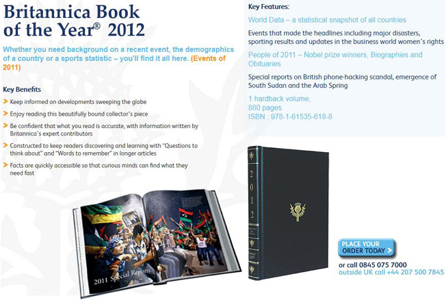
10. Adopt familiar language. Encyclopedia Britannica increased its conversion rate by 103% when they introduced clear text which followed their readers’ thoughts.
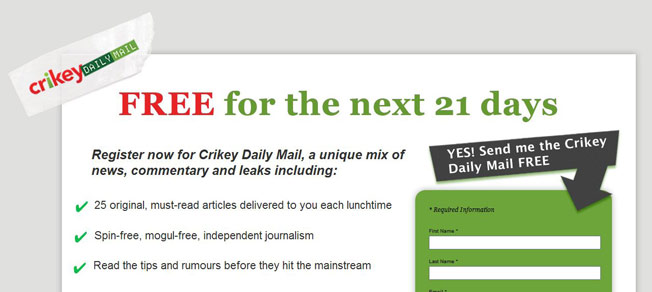
11. Include fascinating bullets. These are much easier to read. And even skimmers pay attention to them. Crikey explains in three clear bullet points why you should sign up.
12. Tell us why. You know why the legendary slogan “Because you’re worth it” is powerful don’t you? Giving your web visitors a reason why they should buy could double your response rate!

13. Don’t focus on features. Focus your copy on benefits and increase your conversion rate by 26%.
14. Anticipate objections. And ensure you address them all. Sean d’Souza uses testimonials to address potential objections to joining his membership site for small business owners.

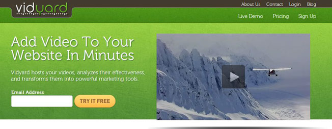
15. Try video. Do your web visitors prefer watching a video to reading your copy? Using a video can increase your opt-in rate by 100%. Make sure you test – videos sometimes decrease conversion rates.
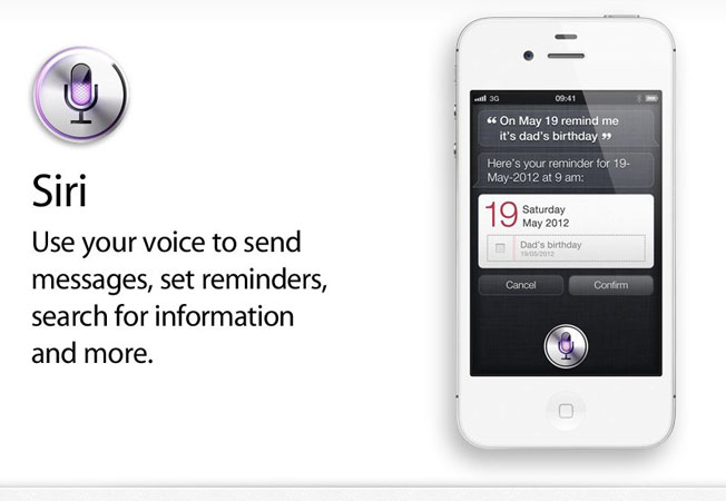
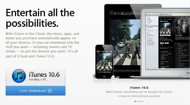
16. Write tight. Don’t waste precious time. Scrap redundant words, and replace long words by short ones. Apple marketers are masters at keeping it short.
How to become trustworthy
You’ve got a fantastic product or an amazingly helpful newsletter.
Your copy is compelling.
Is that enough for people to click, subscribe, or buy?
No.
You need to avoid silly spelling errors and grammar goofs because they make you look dumb.
You need to show that you are genuine.
You need to provide re-assurance.
Follow these 9 simple tactics to show you can be trusted.
17. Avoid using I and we. Being self-centered makes you less credible. When Away Find removed the sentence Let us find urgent message and focused their sub headline on you instead, they increased signups by 91%.

18. Provide proof. Case studies, statistics, and research results make your proposition more convincing.
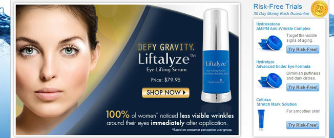
19. Be unique. Nobody has confidence in copy cats. Rackspace stands out among hosting services by focusing on their fanatical support.

20. Provide a reminder. Tell your web visitors to trust you. Really? Yes, it increases your trustworthiness. UK breakdown organisation AA reminds web visitors that they can be trusted.

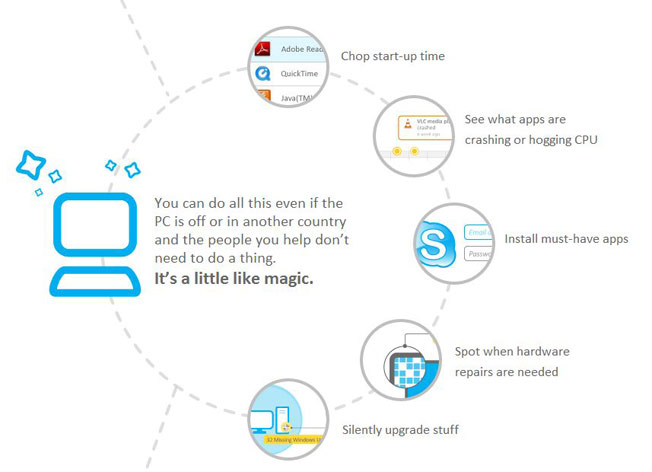
21. Use a conversational tone. Being human increases trust. Who wants to chat with a corporation? Soluto uses everyday language to explain their offer.
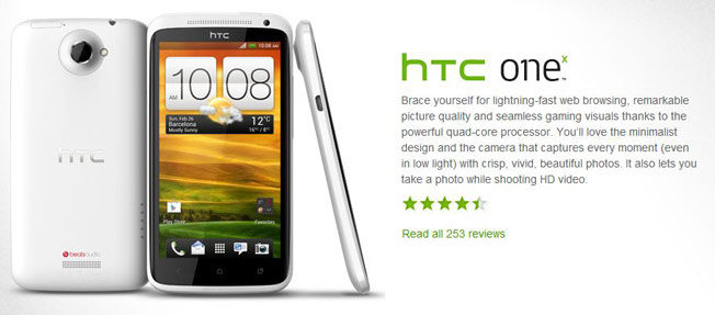
22. Add social proof. You know the power of social proof, don’t you?
23. Provide confidence. Be clear about your privacy policy. Provide a money back guarantee. Have a clear returns policy. Zappos clearly states its returns policy on each web page.

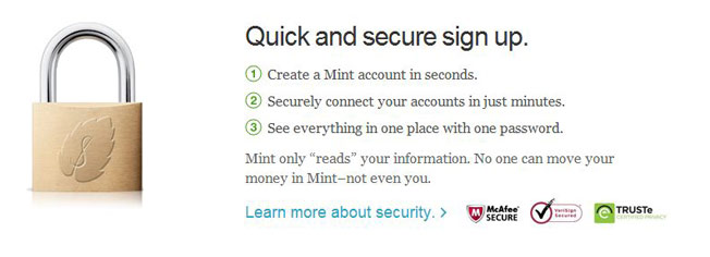
24. Use symbols of trust. Several studies show the impact an authorized ealer badge, a trust seal or a security badge has on conversions.
25. Add a phone number. It can increase your conversion by 1.8%!
How to create a persuasive call to action
Why are you creating a landing page?
Do you want your web visitor to try out your service?
To subscribe to your newsletter? Or to buy something?
You have to choose one objective. And make your call to action irresistible.
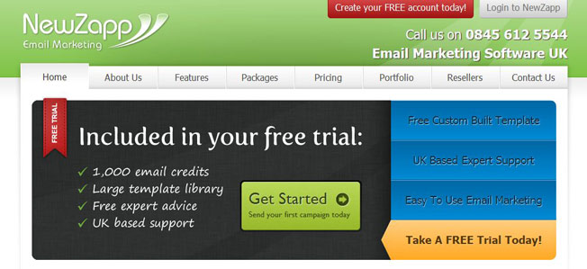
26. Be clear. Telling people exactly what they should do can increase your conversion rate by 173%. Swapping Give feedback for the clearer Respond nowincreased conversion rate by 13%.
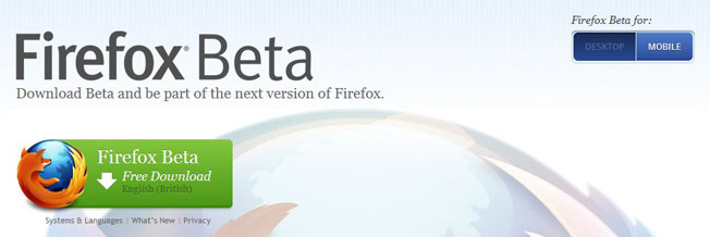
27. Have one primary call to action. Focus your landing page on one primary call to action. Making your secondary calls to action less obvious can increase conversions by 15%.
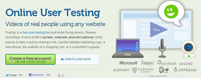
28. Remove side bars. When Conversion Rate Experts removed their right side bar sign-ups increased by 25.9%.
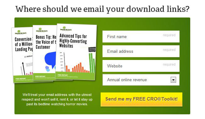
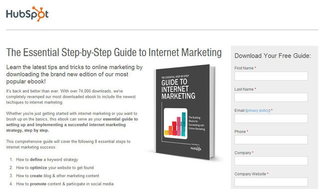
29. Remove top navigation. Removing your top navigation bar can increase sign-ups by 100%. On a HubSpot landing page you can either download a report or share the page; you can’t go anywhere else.
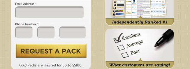
30. Don’t use vague words. Who wants to submit something, go to next, or read more? Express Gold Cash increased their conversion rate by 47.7% when they changed their call to action from submit to request a pack.
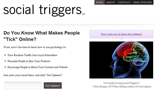
31. Set expectations. Be clear about your offer and how your web visitor will benefit. Derek Halpern explains clearly what you’ll learn and how you’ll benefit when you sign up to Social Triggers updates.
32. Increase value. Can you offer a bonus? Make sure you show the value of your bonus, too!
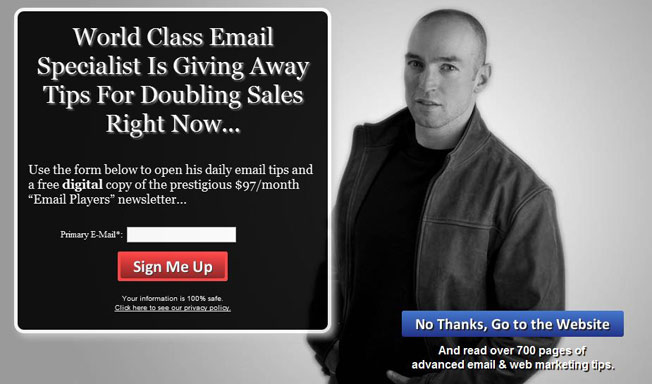
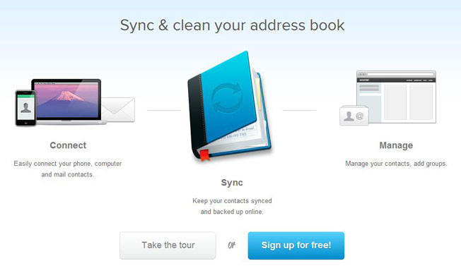
33. Use the power of FREE. Offer free returns or free shipping. FREE is more valuable than a discount. When Soocial added “It’s free”, conversion went up by 28%.
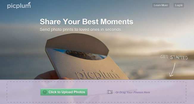
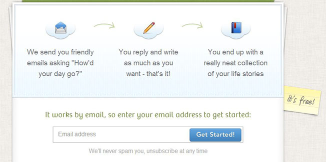
34. Reduce barriers. Research suggests that fewer form fields increase signups. To get started with Oh Life you only need to fill in your email address. That’s all.
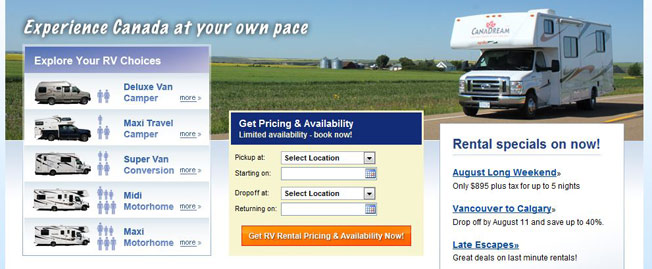
35. Be urgent. Bookings increased by 106% when Canadream changed its button text from Go to Get RV Rental Pricing and Availability Now.
How to seduce with good design
You know that good design guides your web visitors to take action, don’t you?
And that beautiful design can increase conversion rates?
Follow these 10 steps to seduce your web visitors with inspirational design.
36. Stand out. Make your call to action button bigger, use a contrasting color, and increase your font size. A/B tests show how button changes increase conversions by 5%, by 9%, and even by 21%.

37. Show more. Detailed product photos, 360° rotating images, and shots of your product in context can increase your conversion rate.
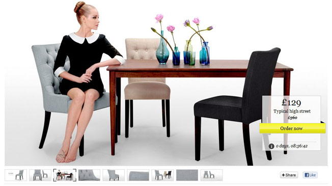
38. Don’t use stock photos. Because they are drab, stale, and spiritless; and everyone ignores them. Are there no real people working for you?
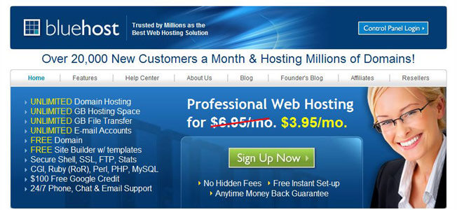
39. Add a photo of a real person. Because it can double your conversion rate. When Highrise included a real person on their landing page paid signups went up by 102.5%.
40. Add captions. Your web visitors are more likely to read your captions than your copy, so don’t miss this opportunity for a mini sales message.
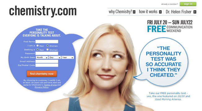
41. Employ the power of the eye. Use images of people or animals and let them stare to your call to action.
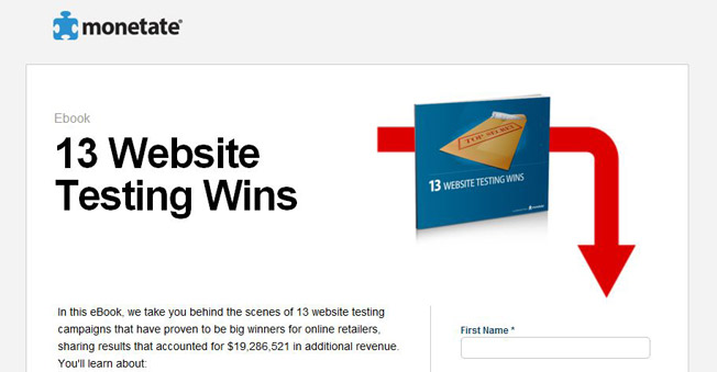
42. Use an arrow. When Monetate pointed an arrow to their form downloads went up by 68.3%.
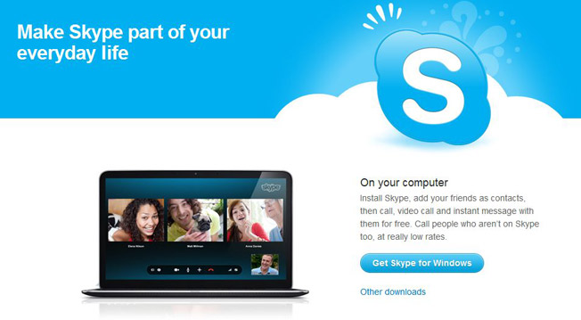
43. Embrace white space. It will make your call to action stand out. When Skypesimplified their landing page and increased white space, downloads increased by 5%.
44. Be attractive. A well balanced website with a carefully selected color palette makes you more trustworthy.
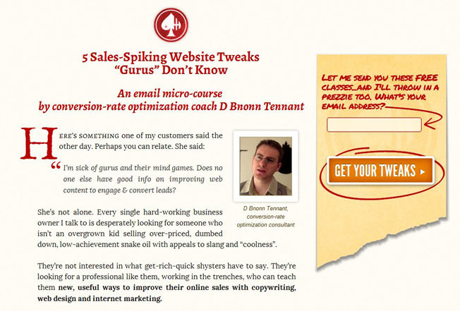
45. Have your form above the fold. Because that’s where web visitors spend 80% of their time.

The blog was originally published at Kissmetricsc.om here
Related Posts:
David Johnson
Latest posts by David Johnson (see all)
- 7 Free Music Making Apps For 2020 - July 21, 2017
- 45 Ways To Impress Your Website Visitors With Effective Landing Pages - July 19, 2017